Hearthstone
Case/requirements
My nephew has only 5% eyesight and really likes to play hearthstone on his tablet. I talked to him and he mentioned that he liked the game because everything is so clear when he fights against someone. The only thing he found annoying was the actual other slides such as the adventure screen. Once he was in the game he had no trouble dueling with someone but if he wanted to do something else he would have to focus a lot more and that was rather exhausting.
It was my task to:
1. Find a way to make it easier for him to navigate through those menu screens.
2. Get familiar with the way Hearthstone's artwork is being made so that I could extend or re-design the current state.
Phase 1, understanding the target group
So the first thing I did was trying to view everything the way my nephew sees. I paid him a visit and sat down with him and discussed how he sees things. Now he has to angle his face as he can only see in the corner of his eyes. So what we end up doing was simply zoom out and slightly blur all the screens Hearthstone has to offer. This made that I also could not see little details, those who are nice to those who have no trouble seeing but only distract for those who have less eyesight.
Phase 2, The Blizzard style
Now before I started experimenting on changes/improvements, I took it upon myself to dig into the style of hearthstone as I had not familiarized myself with that. I had played the game for quite some time but never really paid to much attention to it in an artistic way. So I made 2 different versions of a notification to familiarize my self with the style and these turned out not bad at all.


Phase 3, Sketch phase
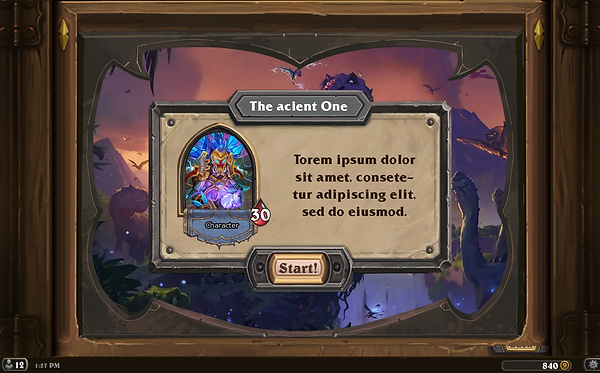
I have picked one of the screens that were rated difficult by my nephew. I have gone ahead and marked what parts were easy to read/view and what sections were not.
As you can see the right big panel was not hard to read as it is pretty big and very minimal detail. The left panel, on the other hand, has a lot of small details and can at times (not always) be hard to read. Now the design looks great but I think I will be able to find a way to re-design this page so that it be easier to navigate through the different bosses.
To do this I started sketching. During this phase, I am trying to find a way to display the same information in a way that still makes sense but is bigger/more clear to those with bad eyes sight. Some of my sketches can be seen down here.


As you can see, I have been able to produce a large number of possibilities. Now I am going to bring the list of possibilities down to a top 3 and make low fidelity prototypes of them so I can test if they work fundamentally. The one that works best will be transferred into a high fidelity version.
