Canceled project
Introduction
Net King Call is a tabletop action game. I was being hired as a freelancer to aid with the UX and UI of the game.
It was my task to:
1. Design Panels
2. Design Buttons
3. Design Portraits
4. Design Icons
Phase 1, Panels
The top priority for this game were the panels. At the time I came in only the default panels were used provided by unity. The game also has a somewhat steer learning curve meaning that the game does display a fair amount of text and panels.
The style for the game had to be cartoony and futuristic. So I started my pc up and started to sketch. I always like to give my clients lots of options as this makes it easier to find what they are looking for. In this case, the bottom left panel was chosen as this one was most versatile and could easily be converted to other sizes which was a great choice due to their budget.
While design these sketches I tried to make the panels as readable as possible as well as staying away from hard corners as this would take away from the cartoony look that was desired. I also tried to implement triangular shapes as the game is settled in a space environment.

Phase 2, Coloring the panels
Now coloring is not my strong point but in this case, there was no need to get extremely complex. The game itself is fairly detailed and adding a panel that is also extremely detailed would highly increase the noise on the screen. By adding primarily flat colors and a high contrast (using mostly grey and 1 leading color) there was this pleasing distance between the game and the panels which allowed for the user to sort of rest his eyes when reading the content.
Now, as you can see in the images below, I at first tried a transparent background with a yellow tint. I self-found that transparency could cause problems with the content text. So I made the background solid. The guys from the game request a blue version as they preferred that.
At this point in time the buttons, font and shapes are place holders.

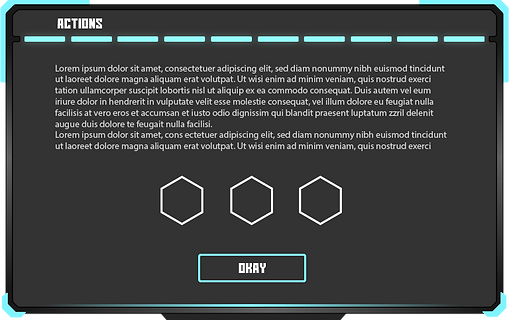
Phase 3, Button design
Since the panels I designed were really simp[le I was able to design buttons that were fairly appealing and could be ab it more interesting/detailed. As you can see in the image below I once again provide a sheet with a few designs so that the guys could choose. I also made sure that some buttons (mostly on the left) were a bit more simple and some more detailed (mostly on the right).
They were allowed to choose 3 buttons. The chose buttons can be found in the next paragraph. Now important to know is that I always add a recommendation when I provide these sheets. I find that often, developers and other IT guys do not really have the artistic background to make the correct choice (some do) and also do not like to have to choose, being afraid that their choice is not the right one. This advice is always light and just lays down the elements that are already there and why the designed elements would go well or would not go well with them.

Phase 4, Final buttons
For the buttons, I chose a slightly darker tint to add more contrast between the panels and buttons. This also allowed for the possibility to add a subtle outer glow making the whole design even more sci-fi alike.

Phase 6, portrait
As always, my top priority is to get clear what style is expected to be produced from the client's point of view. Now, in this case, I had 1 major assignment. The overall look and feel. I was assigned to make the game menu's and Gui feel both somewhat futuristic combined with some dark aura alike elements.
The first thing I did was defining the vision of the project leader. I did this through mood boards. I used these 2 mood boards for my first iteration. Moodboard 1 was to explore visual styles that could go well with shooters. This was a somewhat general exploration as I would discuss this mood board later on to share elements in which I thought that these would go well with the set vision. Moodboard 2 was heavily focused on icons and typography. The icons were there to see which icon style would go well with the visual style. The typography was there because the project leader and requested to (if possible) design a way to have normal English text transfer into this mythical/alien alike languages, occurring when the player's health would below.

