Introduction
Wraith is a competitive shooter. As the core mechanics are being finalized and the team is readying up to release their Alpha version, I was brought onto the team to both analyze and help develop the esthetics for the game.
It was my task to:
1. Define the game brand
2. Make sure all visual aspects of the games were in harmony
3. Assure that the given vibe was communicated through the visuals, typography, etc in the game.
Phase 1, Research
As always, my top priority is to get clear what style is expected to be produced from the client's point of view. Now, in this case, I had 1 major assignment. The overall look and feel. I was assigned to make the game menu's and Gui feel both somewhat futuristic combined with some dark aura alike elements.
The first thing I did was defining the vision of the project leader. I did this through mood boards. I used these 2 mood boards for my first iteration. Moodboard 1 was to explore visual styles that could go well with shooters. This was a somewhat general exploration as I would discuss this mood board later on to share elements in which I thought that these would go well with the set vision. Moodboard 2 was heavily focused on icons and typography. The icons were there to see which icon style would go well with the visual style. The typography was there because the project leader and requested to (if possible) design a way to have normal English text transfer into this mythical/alien alike languages, occurring when the player's health would below.
Moodboard 1 - Visuals style
Moodboard 2 - Typography

Phase 2, Styleguide
When I presented these mood boards in the meeting I had with the project leader I took notes on which aspect he liked and which he did not. I then took his feedback and started to craft the first 2 versions of the yet to come style guides. These style guides have been made in such a way that the project leader would be able to read/preview them and get a great sense of what the menus could potentially be like. The logo was an instant hit and got implemented instantly. The color combinations were great as well and the blue/grey version came on top (Iteration 1 style guides can be previewed down here).


Phase 3, The low fidelity prototype(s)
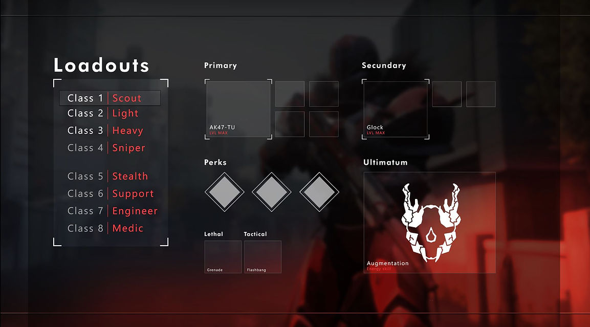
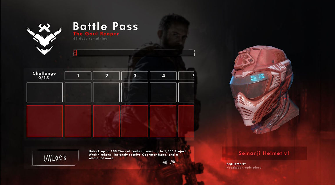
The low fidelity version(s) got a lot of great feedback and I then took this and started to work on the more finalized version of the UI/flow. In this phase, I mainly focus on making something that is very versatile as some aspects of the game are still likely to be tweaked or changed. As you can see in the images below the background can be changed to almost anything. In the next phase, I will be exploring how this version goes with a 3D environment in the back. The project owner has some really awesome ideas with a 3D model in the back etc. It will be up to me to validate if the UI and 3D aspects go well together and if not how I can fix that.
You will also notice that I have not strictly have been following the style guide as I found that some other colors worked a bit better. In the end its a guide, not something you have to copy 100%!
 |  |  |  |
|---|
Phase 4, The final version
The final phase of this design journey. Now that I have a clear vision of what the final Ui has to look like I started to work with a new program where I can upload all the buttons and panel made and make them functional so that the dev team could take what I had made and implement it in the actual game.